Contact Strip
Please click on the thumbnail to view the contact strip full-size.
Green circles indicate images that I considered using, as I liked them.
Red arrows indicate images that I didn't like at all.
"Carnival."
Please click on images to view full size.
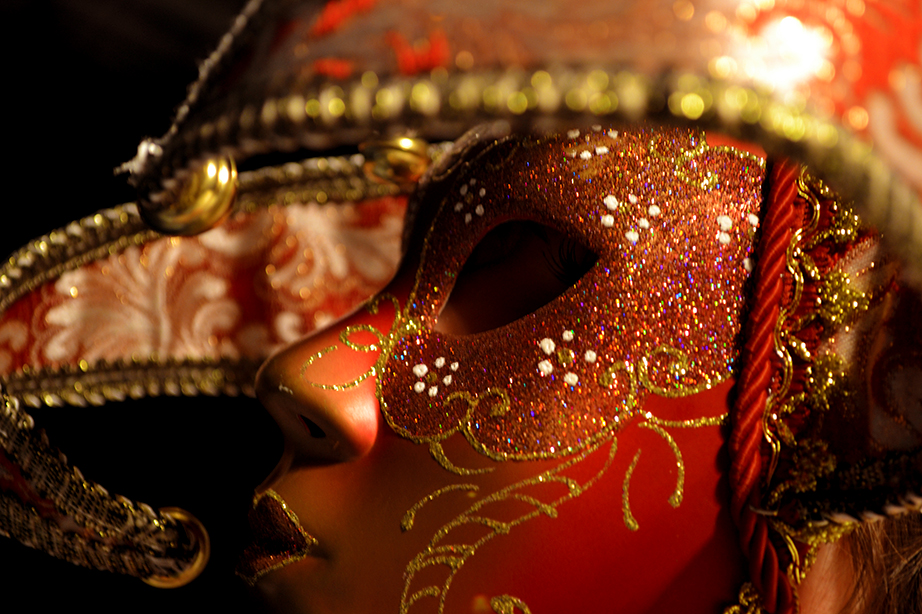
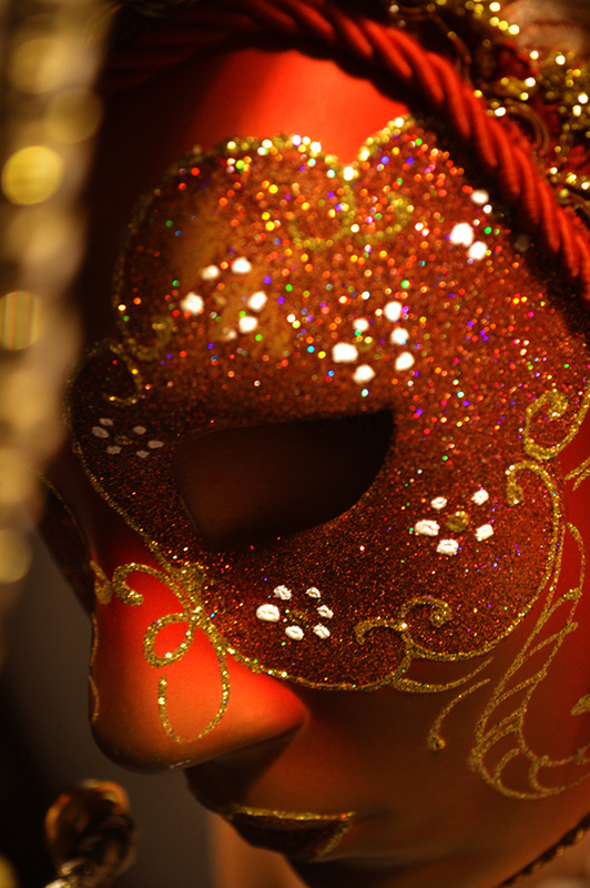
My aim in this photoshoot was to develop on from my previous attempt "Autumn", however this time I decided to use a model instead of doing it as a self portraiture shoot. Firstly, I chose a model with short hair in order to keep the main focus on the mask, and not on the model themselves. Also, to achieve this, I shot some of the photographs from angles where you cannot see the models eyes through the mask. For example, in this first photograph there is shadow cast over the area where you usually would have been able to view the models expression. I did this by adjusting the over-head lighting in order to cast the majority of the light on the right hand side of the models face. This creates the feeling that the model doesn't want their emotions to be seen, they want to hide behind the safety of the mask. And that is the overall idea behind this shoot, to show how people hide behind their 'masks' in order to disguise their true emotions.
I used a NikonD3100 for this shoot, and over-head lighting. Behind the model, there was a white wall, and to the sides there were black curtains. As you can see in these first two photographs, as they were taken from the side you can only see a dark background. I decided to do this in order to draw the eye to the vibrancy of the colours on the mask, rather than creating a background that suited the image such as what I did in "Autumn."
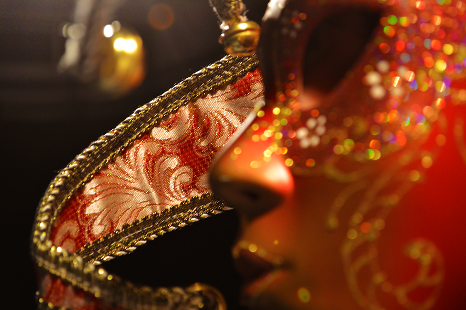
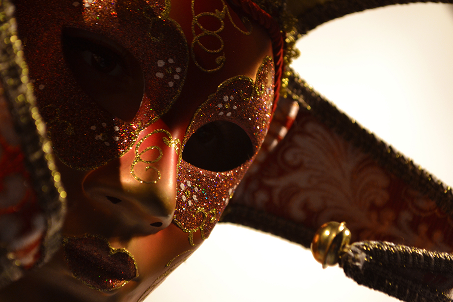
In regards to the title of this shoot, "Carnival", I personally feel as if these photographs look as if the model has just stepped out onto the stage for the first time, into the bright lights and surrounded by an audience. In this situation the model has to 'act' from behind the mask, able to do what is required without actually showing any emotion to the audience. I believe that these photographs show only one emotion: hesitancy. I imagine the model taking a deep breath, preparing themselves for whatever is to follow.
I would like to add that this is only my interpretation of the image, I have designed it so that it can be interpreted in many ways, and that it merely depends on the person viewing the photograph. Some may view this for it's beauty, and not for the emotional aspect behind it, whilst others may see a meaning and story to it. In conclusion, I wanted this shoot to be ambiguous. The photograph above this block of text, to the right, was included in the final images because I like the depth of field that I used. Instead of focusing on the models face, I changed the focal point to the material coming out from the mask beyond. In doing this, the mask looks as if it is dusted in small balls of light, and I really like the overall effect that I have achieved here.
I would like to add that this is only my interpretation of the image, I have designed it so that it can be interpreted in many ways, and that it merely depends on the person viewing the photograph. Some may view this for it's beauty, and not for the emotional aspect behind it, whilst others may see a meaning and story to it. In conclusion, I wanted this shoot to be ambiguous. The photograph above this block of text, to the right, was included in the final images because I like the depth of field that I used. Instead of focusing on the models face, I changed the focal point to the material coming out from the mask beyond. In doing this, the mask looks as if it is dusted in small balls of light, and I really like the overall effect that I have achieved here.
- Please click this one if you wish to view it larger.
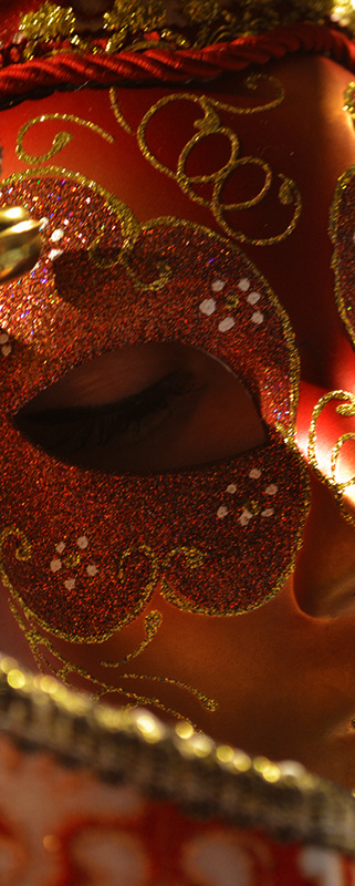
This photograph is a little different from the other ones. Originally, I wasn't going to use it in the final selection, however I decided to crop it and see what the outcome would look like. Overall, I am pleased with how it turned out, and this is the only photograph where you can actually vaguely see the models expression. However, I asked the model to keep her eyes downcast - which once again creates a feeling of ambiguity to the image.
I particularly like how the lighting has cast shadows over the majority of the mask, with one strip of white coming in from the right side of the image, just highlighting the nose piece. My only complaint about this photograph is that through my editing process (which is listed below) the colours still look slightly dull, however increasing the vibrancy once more would only result in a pixelated image.
Also, I like how the mask takes up the entirety of the image, not showing any background unlike the other photographs. This keeps the mask as the focal point, but draws our eye to the models face behind.
This photograph was taken from an angle slightly above the model, I did this in order to create the shadow over the hole where you should have been able to see the models face. Once again, I did this to show the theme of "disguise", the idea of hiding behind the mask and hiding emotions from the audience. I chose to add this photograph to the final selection for a couple of reasons. Firstly, I really like the line of material that is out of focus on the left side of the image, the little round balls of light remind us that there is depth to the photograph, that we as the audience are a small distance away from the subject.
Secondly, I really like how that piece of material has created shadow across the mask, completely hiding the second eye from the audiences view. This further emphasises the theme I have tried to portray. Once again however, I don't feel that the colours are as vibrant as the first two photographs featured on this page, but I still love the overall outcome from the editing.
The background is dark again, much like the first two pictures, however there is a band of light that seems to frame the bottom of the mask, giving the photograph a spotlight effect.
This is the final image I had chosen to edit. Firstly, I shot this photograph from a different angle to the others, so the background was the white wall behind the model. In hindsight as I write this, I believe a black background might have suited the mask well, however I still like how the photograph turned out.
Once again, the editing process enhanced the colours in the mask - but also by editing the levels it created darker shadows, which completely obscured the models eyes from view. I particularly like the rule of thirds in the photograph, and how once again the models expression is hidden from sight.
Overall, I believe that this photoshoot successfully captured the theme of "disguise." It also incorporated a mixture of Mary Raine and Winter Kellys work through the previous development, and resulted in this final shoot before I move on to my secondary proposal.
Editing Process:
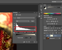
Firstly, I edited the levels in order to increase the shadows in the overall photograph.
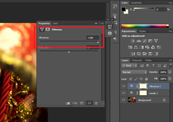
Secondly, I turned the vibrancy up to 100.
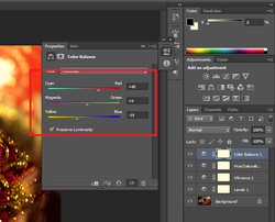
Thirdly, I changed the colour balance bars, one closer to red, and one closer to yellow to further enhance the colours that were prominent in the mask.
